Hello dear reader and welcome to today’s post.
When I was younger, I was under the impression that Monochrome meant black and white. However, I later learned that black and white and the variants of, are known as grey scale.
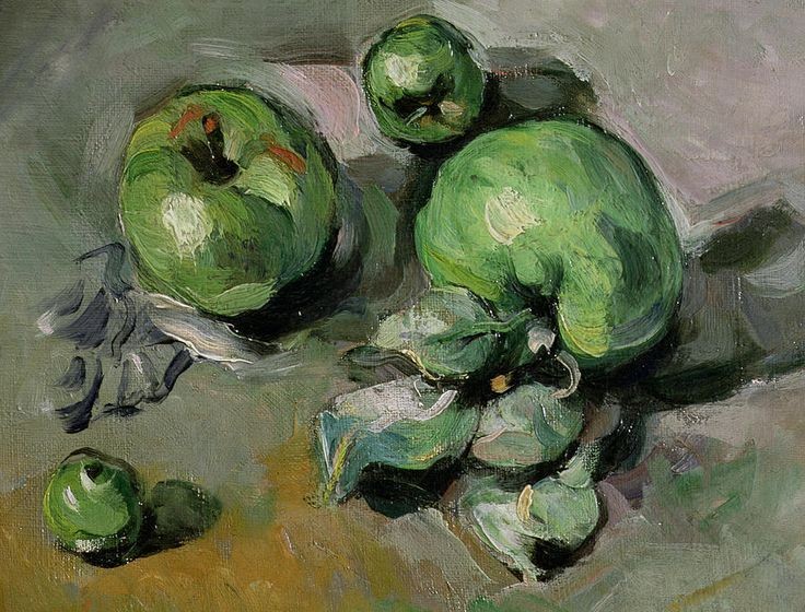
Monochrome is the variant of a single colour. By using tints, shades, and tones a single colour can be used effectively to create an image or picture with beautiful contrast. An example of this would be “still life with apples” by Paul Cezanne. In this painting Cezanne uses only greens of differing tints, shades, and tones to create the definition of the apples. There is very subtle contrast applied by using red on one of the fruits and a small amount of yellow to lift the background.

Tints
A tint is when a colour of any pure hue is mixed with white. This lightens the colour, balancing more vivid colour combinations.
Shade
A shade is when a colour of any pure hue is mixed with black. This darkens the colour making it richer and more dramatic.
Tone
A tone is when a colour of any pure hue is mixed with a neutral grey to lessen the intensity of the hue. It creates a more subtle version of the original hue it will steer away from pastel but could reveal complexities not immediately apparent in the base colour.
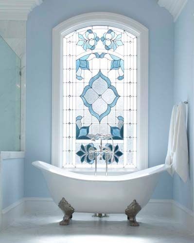
In interior design the use of a monochromatic palette can create beautiful, elegant surroundings. Choose a colour and vary it by adjusting the shade, tint, or tone to prevent the space from being overwhelmed and monotonous. The use of texture and pattern will also improve the final look of the space.

Texture is particularly good at increasing interest to a space, by providing an uneven surface. The significance of this is that light, natural or otherwise, strikes the surface. The natural creation of highlights and shadow gives the space depth and warmth. The use of throw pillows, cushions, rugs, and window treatments are a great way to bring texture into a space.
Using monochromatic prints on your texture items will add visual interest without detracting from the overall look. You can add neutral colours to the pattern, such as black or white as this will liven up the scheme, however, use them sparingly if your goal is to achieve a simple harmonious finish.

The reason monochromatic schemes work so well is because they are harmonious and relaxing. It is difficult to relax in a space filled with jarring primary colours, think about that the next time you are in a fast-food outlet.
If you like art and collectables a monochromatic backdrop is the perfect way to let them shine.